
Introduction
As smart home technologies continue to evolve, homeowners now have access to a level of energy visibility that was almost impossible a decade ago. Smart meters, energy monitoring devices, and home automation systems now provide detailed dashboards that display electricity consumption in real time. These dashboards often show graphs, numbers, and performance indicators that promise to help users better understand how their homes use energy.
However, many homeowners quickly realize that interpreting these dashboards is not always straightforward. Energy dashboards present a large amount of technical data, including kilowatt usage, peak demand, device-level consumption, and historical trends. Without understanding what these numbers represent, the information can become confusing rather than useful.
Learning how to interpret smart home energy dashboards is essential for turning raw data into meaningful insights. When used correctly, these dashboards help identify inefficiencies, detect abnormal consumption patterns, and guide smarter energy decisions.
In this article, we explore how energy dashboards work, what the most common metrics mean, and how homeowners can use this information to improve efficiency and reduce electricity costs.
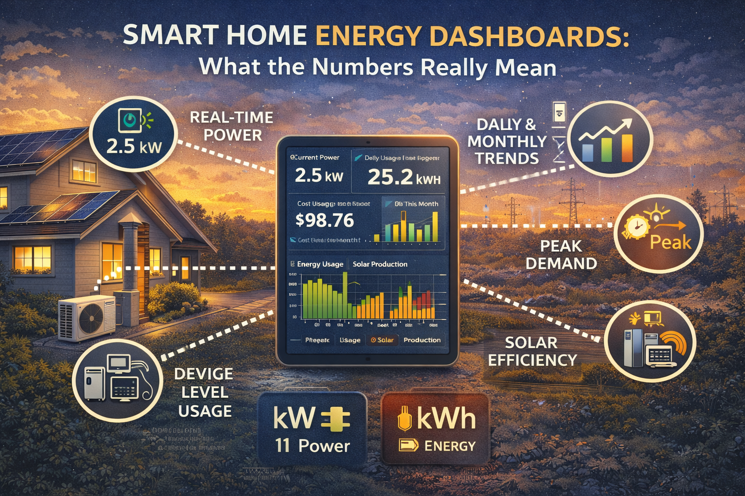
What Is a Smart Home Energy Dashboard?
A smart home energy dashboard is a digital interface that displays information about how electricity is consumed within a home. These dashboards are typically accessed through mobile applications, web portals, or home automation platforms connected to energy monitoring devices.
Energy dashboards collect data from smart meters, circuit monitors, solar systems, or individual smart devices. This data is then organized into visual charts, graphs, and real-time metrics that show how electricity flows through the home.
The purpose of these dashboards is to transform complex energy measurements into visual insights that homeowners can easily track over time. Instead of waiting for monthly utility bills, users can see energy consumption patterns instantly and identify when usage spikes occur.
Understanding how to read these dashboards turns them into powerful tools for improving household efficiency.
Understanding Power vs Energy: kW vs kWh
One of the most common sources of confusion in energy dashboards involves the difference between power and energy.
Power is measured in kilowatts (kW) and represents the rate at which electricity is being consumed at a specific moment. When a dashboard shows real-time power usage, it indicates how much electricity the home is drawing from the grid at that exact moment.
Energy, on the other hand, is measured in kilowatt-hours (kWh). This unit represents the total amount of electricity consumed over time. Utility companies typically charge for electricity based on kilowatt-hours used during a billing period.
For example, a device that uses one kilowatt of power for one hour consumes one kilowatt-hour of energy.
Understanding this distinction helps homeowners interpret energy dashboards more accurately. Real-time power values show immediate consumption, while energy values reveal overall usage patterns.
Real-Time Energy Monitoring
One of the most valuable features of energy dashboards is real-time monitoring. This capability allows homeowners to see how electricity usage changes throughout the day as devices turn on and off.
For instance, turning on a microwave, air conditioner, or electric oven may cause a noticeable spike in real-time power usage. By observing these changes, users can quickly identify which appliances consume the most electricity.
Real-time monitoring also helps detect unusual consumption patterns. If power usage remains high when the home is unoccupied, it may indicate that devices are operating unnecessarily or drawing standby power.
This immediate feedback encourages more mindful energy habits and allows homeowners to experiment with different energy-saving strategies.
Daily and Monthly Consumption Trends
Beyond real-time monitoring, energy dashboards typically display historical consumption data. This information is often presented in daily, weekly, or monthly charts that illustrate how energy usage evolves over time.
These trends help homeowners identify recurring patterns in their electricity consumption. For example, energy usage may increase during hot summer months due to air conditioning or rise in winter when heating systems operate more frequently.
Comparing monthly trends also allows homeowners to measure the impact of energy efficiency improvements. Installing LED lighting, upgrading appliances, or adjusting thermostat schedules may result in noticeable reductions in energy usage.
Historical data transforms energy dashboards into valuable tools for long-term energy planning.
Identifying Peak Demand Periods
Many energy dashboards highlight peak demand periods—moments when electricity usage reaches its highest levels. Peak demand is important because it often determines the maximum load placed on the electrical system.
In some regions, electricity pricing varies depending on the time of day. These time-of-use tariffs charge higher rates during periods of high grid demand.
Energy dashboards help homeowners identify when peak consumption occurs in their homes. By shifting certain activities—such as running dishwashers or charging electric vehicles—to off-peak hours, users can reduce electricity costs.
Understanding peak demand also helps prevent overloading electrical circuits and improves overall energy management.
Device-Level Energy Monitoring
Advanced energy monitoring systems can identify the electricity consumption of individual appliances. This capability provides a detailed view of how each device contributes to overall energy usage.
For example, dashboards may display separate consumption data for refrigerators, washing machines, heating systems, and entertainment devices. By comparing these values, homeowners can determine which appliances consume the most energy.
Device-level monitoring is particularly useful for identifying inefficient appliances or detecting malfunctioning equipment. A refrigerator that suddenly consumes significantly more energy than usual may require maintenance or replacement.
This level of detail allows homeowners to target efficiency improvements where they will have the greatest impact.
Solar Energy Integration
For homes with solar panels, energy dashboards often include additional metrics that track solar generation and grid interaction.
These dashboards typically display how much electricity the solar system produces, how much energy the home consumes, and how much power is exported to or imported from the grid.
Understanding these metrics helps homeowners optimize solar self-consumption. For example, running appliances during peak solar production hours increases the amount of solar energy used directly within the home.
Solar energy dashboards also help track long-term system performance and identify potential issues with panel output or inverter efficiency.
Authority Insight: Data Awareness Drives Energy Efficiency
From an engineering perspective, energy dashboards represent one of the most powerful tools for improving residential energy efficiency. Historically, homeowners had very limited visibility into how electricity was used within their homes. Monthly utility bills provided only a summary of total consumption, offering little insight into daily behavior.
Smart energy dashboards change this dynamic by providing continuous feedback about energy usage. When people see how their actions influence electricity consumption in real time, they become more aware of inefficiencies and opportunities for improvement.
Studies have shown that households with detailed energy monitoring often reduce electricity consumption simply because users become more conscious of how energy is used.
In other words, access to data encourages smarter decisions and more efficient habits.
Frequently Asked Questions
What does kWh mean on an energy dashboard?
Kilowatt-hours (kWh) measure the total amount of electricity consumed over time and are the units used for electricity billing.
Why does my dashboard show sudden spikes in energy usage?
Spikes usually occur when high-power appliances such as ovens, air conditioners, or electric heaters turn on.
Can energy dashboards help reduce electricity bills?
Yes. By identifying inefficient devices and peak consumption periods, homeowners can adjust energy usage and reduce costs.
Are energy dashboards accurate?
Most modern systems are highly accurate when connected to smart meters or circuit monitoring devices.
Do I need solar panels to use an energy dashboard?
No. Energy dashboards can monitor electricity usage in any home, regardless of whether solar panels are installed.
Final Considerations
Smart home energy dashboards transform complex electricity data into accessible insights that homeowners can use to improve efficiency. By understanding key metrics such as real-time power, total energy consumption, peak demand, and appliance-level usage, users gain a clearer picture of how their homes operate.
This information empowers homeowners to make informed decisions about energy use, identify wasteful patterns, and evaluate the effectiveness of efficiency upgrades.
As smart home technology continues to expand, energy dashboards will play an increasingly important role in helping households manage electricity consumption more intelligently and sustainably.

Daniel Harper is a graduate engineer with a postgraduate specialization in Intelligent Solutions and Industry 4.0 technologies. He leads the Mogarzi Team, focusing on smart home automation, residential energy efficiency, and intelligent energy management systems. His work combines engineering principles with practical home optimization strategies, translating complex technical concepts into actionable insights for homeowners seeking smarter and more efficient living environments.