
Smart homes generate a surprising amount of data. Thermostats log temperature changes, smart plugs track device usage, solar inverters record production, and whole-home monitors measure total consumption. Yet in many homes, this information remains scattered across different apps. One app shows lighting, another shows HVAC, another shows energy, and none tell the full story. As a result, homeowners have data but lack clarity.
At the same time, energy efficiency depends on understanding patterns. Knowing that your bill is high is not the same as knowing why. Did usage spike in the evenings, during heat waves, or after buying a new appliance? Without a clear view, decisions become guesses. Guesses can help sometimes, but they rarely lead to consistent optimization.
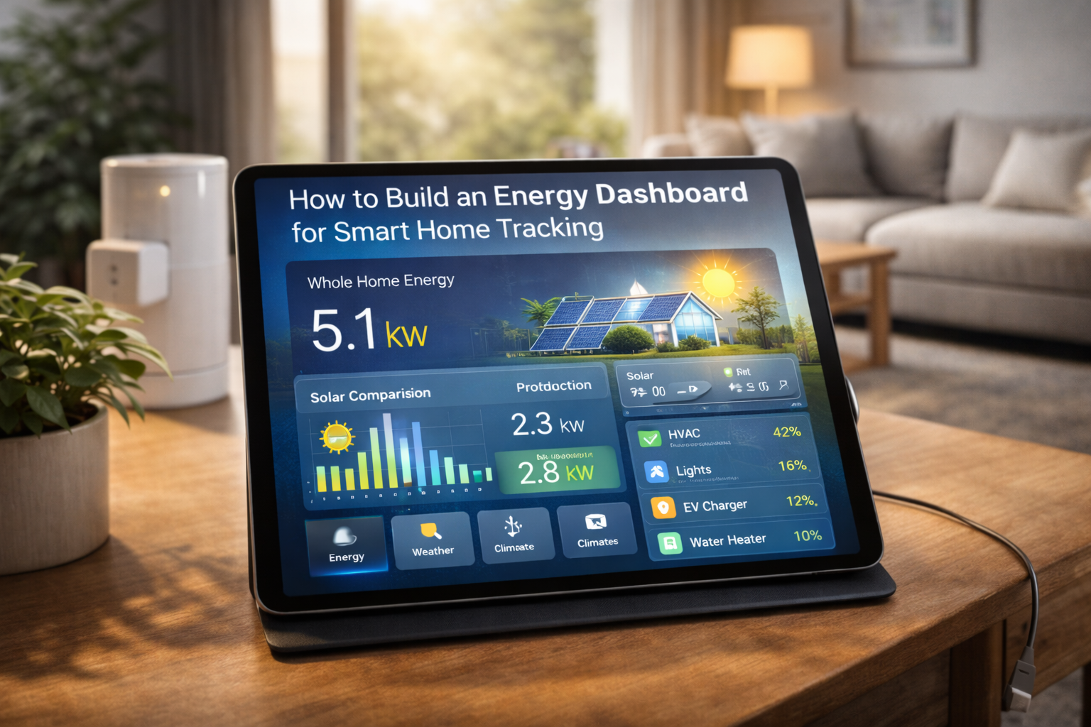
An energy dashboard solves this by bringing data together in one visual space. Instead of switching between apps, you see trends, peaks, and relationships in a single interface. More importantly, a good dashboard does not just display numbers. It highlights what matters. Learning how to build an energy dashboard for smart home tracking shows how data can move from passive information to active guidance.
What an Energy Dashboard Really Is
An energy dashboard is a visual interface that displays energy-related data in an organized and meaningful way. It can include real-time consumption, historical usage, solar production, battery status, device-level loads, and even cost estimates. The goal is to make energy patterns understandable at a glance.
Unlike a simple meter reading, a dashboard adds context. Graphs show how usage changes over time. Comparisons reveal whether today is typical or unusual. Breakdowns show which categories dominate. This context is what turns raw data into insight.
A dashboard can live inside a smart home platform, a dedicated energy app, or a custom interface. The exact tool matters less than the design. A cluttered dashboard can be as confusing as no dashboard at all. A good one simplifies without oversimplifying.
Why Smart Homes Benefit Most from Dashboards
Traditional homes can use dashboards, but smart homes benefit especially because they already produce rich data. When devices are connected, they become measurable. When they are measurable, they can be visualized.
Smart homes also allow action. If a dashboard shows high usage, automations can respond. Lights can dim, thermostats can adjust, or devices can delay operation. This closes the loop between observation and response.
Additionally, smart home owners are often more interested in optimization. A dashboard aligns with that mindset. It becomes part of how the home is managed, not just monitored.
Step 1: Define Your Goal First
Before building a dashboard, it helps to define its purpose. Some people want to lower bills. Others want sustainability insights. Some want to track solar self-consumption. Others want to detect anomalies.
Your goal influences what to display. A cost-focused dashboard may emphasize currency and time-of-use periods. A sustainability-focused one may highlight carbon intensity or solar ratios. A troubleshooting dashboard may focus on real-time spikes.
Without a goal, dashboards risk becoming data dumps. With a goal, they become tools.
Step 2: Choose Your Data Sources
An energy dashboard is only as good as its data. Common sources include whole-home energy monitors, smart meters, solar inverters, battery systems, and smart plugs.
Whole-home monitors provide the backbone. They show total consumption. Smart plugs add detail for specific devices. Solar systems add production data. Batteries add storage insights.
Weather data can also be useful. Temperature often correlates with HVAC usage. Seeing both together can explain patterns.
The key is reliability. Stable, accurate data builds trust in the dashboard.
Step 3: Select a Platform
Several platforms can host energy dashboards. Home Assistant is popular for customization. Some energy monitor brands include built-in dashboards. Other users prefer dedicated visualization tools like Grafana.
The best platform depends on comfort level. Beginners may prefer built-in dashboards. Advanced users may enjoy custom layouts.
Regardless of platform, clarity should be prioritized over complexity.
Step 4: Decide What to Show
A strong dashboard usually includes a few core elements. Total current usage helps with awareness. Daily and monthly graphs show trends. Category or device breakdowns add insight.
Solar homes may add production vs consumption comparisons. Battery homes may show state of charge and flows.
However, more is not always better. Too many widgets can overwhelm. It is often better to start simple and expand.
Step 5: Use Good Visualization Principles
Visual design matters. Line charts are good for trends. Bar charts are good for comparisons. Gauges can show current load but should be used sparingly.
Color coding helps. For example, green for solar production and red for high consumption. Consistent colors reduce cognitive load.
Labels should be clear. Units should be visible. Time ranges should be selectable.
A dashboard should be readable in seconds.
Step 6: Add Context, Not Just Numbers
Numbers alone can be abstract. Context makes them meaningful. Showing today vs yesterday or this month vs last month adds perspective.
Cost estimates can add relevance. Even approximate cost can motivate attention. Some users also like to show goals or targets.
Context turns data into a story. Stories are easier to understand than raw figures.
Step 7: Make It Accessible
A dashboard is only useful if it is seen. Placing it on a wall tablet, a frequently used app, or a main smart home screen helps. If it is hidden behind menus, it may be ignored.
Accessibility also includes readability. Large fonts and clear charts help quick interpretation.
The goal is light-touch awareness, not constant monitoring.
Step 8: Connect It to Action
The most powerful dashboards link to action. If consumption spikes, you might have a quick way to check which devices are on. If solar production is high, you might trigger flexible loads.
Some advanced setups include alerts. For example, notifications for unusually high usage. However, alerts should be used carefully to avoid fatigue.
Actionability turns a dashboard from passive to active.
Common Mistakes to Avoid
One common mistake is chasing perfection. Energy data will always fluctuate. The goal is trends, not exactness.
Another mistake is overloading the dashboard. Too many charts reduce clarity. Simplicity often wins.
Some users also forget to review the dashboard. Even a quick weekly glance can be valuable.
Finally, ignoring calibration or setup errors can lead to misleading data. Initial verification is important.
Long-Term Value of an Energy Dashboard
Over time, a dashboard builds literacy. Homeowners learn what normal looks like. This makes anomalies stand out. It also helps evaluate upgrades.
A new appliance, insulation improvement, or solar installation can be assessed with real data. This supports smarter investments.
The dashboard becomes a reference point. It reflects how the home evolves.
The Psychological Side
Seeing energy visually can change perception. Spikes look dramatic. Trends feel tangible. This can encourage mindful use.
However, it is important not to become anxious about every change. Energy use naturally varies. The dashboard should inform, not stress.
Balanced use leads to the best experience.
Conclusion
Building an energy dashboard for smart home tracking is less about technology and more about clarity. By gathering data in one place and presenting it thoughtfully, homeowners gain a clearer view of how their home uses energy. This clarity supports better decisions, smarter automations, and more intentional habits.
A good dashboard does not demand constant attention. It quietly informs. It highlights patterns and reveals opportunities. Over time, this awareness can lead to meaningful improvements in both cost and sustainability.
In a smart home filled with connected devices, an energy dashboard acts like a map. It shows where energy flows and where it might be optimized. With the right design and goals, it becomes one of the most useful tools in a modern home.

Daniel Harper is a graduate engineer with a postgraduate specialization in Intelligent Solutions and Industry 4.0 technologies. He leads the Mogarzi Team, focusing on smart home automation, residential energy efficiency, and intelligent energy management systems. His work combines engineering principles with practical home optimization strategies, translating complex technical concepts into actionable insights for homeowners seeking smarter and more efficient living environments.